The bathroom, of course!
Since literally every square inch of this house needs an extreme makeover, we definitely needed a plan on how to make this livable while we save up for some of the larger, more fabulous renovations. We decided anything that effected the functionality of the house needed to come first and then anything small that can be done quickly and have a big impact would come next.
One of the first projects, influenced by this logic, was our hall bathroom. Based on the home inspection, there was a chance the bathtub was leaking and rotting the wood around and below so we felt like it was a risk to let it go and not replace the tub. As some of you may know, if you are ripping out a tub, you might as well take the rest of the bathroom with it. And lucky for me, this was the fun part!
As for the construction, this was a little more than what I trusted myself to take on. Luckily, I have an amazing contractor! (Anyone in the Tahoe/Reno area looking for help, hit me up. CMJR Construction is fantastic to work with). For their part, they took this baby down to the studs and then built her all the way back up again (self esteem included). They were extremely helpful when we realized I bought an extra large tub (yes, kind on accident, kind of on purpose) which required moving up all of the plumbing for the bathtub and shower. Bonus though, now grown adults tall can shower in there! They were also total rockstars while painstakingly installing my very gorgeous, but very uneven shower tile. I’m fairly certain there was an extensive revenge plot during that phase, but they were total professionals to my face. Hopefully the bribe of cookies and beer softened the blow a bit.
From a design standpoint, I wanted something that felt modern, but not so contemporary that is will be out of style in two years. The tub and tile surround are something you only want to update once so I used that as a base for the design and layered pieces on top that feel a little trendier and will be easy to update later on. Inspired by both the “mountain modern” aesthetic and the Tahoe landscape, I chose simple, naturals colors. This allowed me to play with textures that complement each other without competing. This combination created a space that I felt was serene and calming, but still interesting.
I could not be more happy with the end result. This is definitely (as weird as it is to say) one of my favorite rooms in the house.
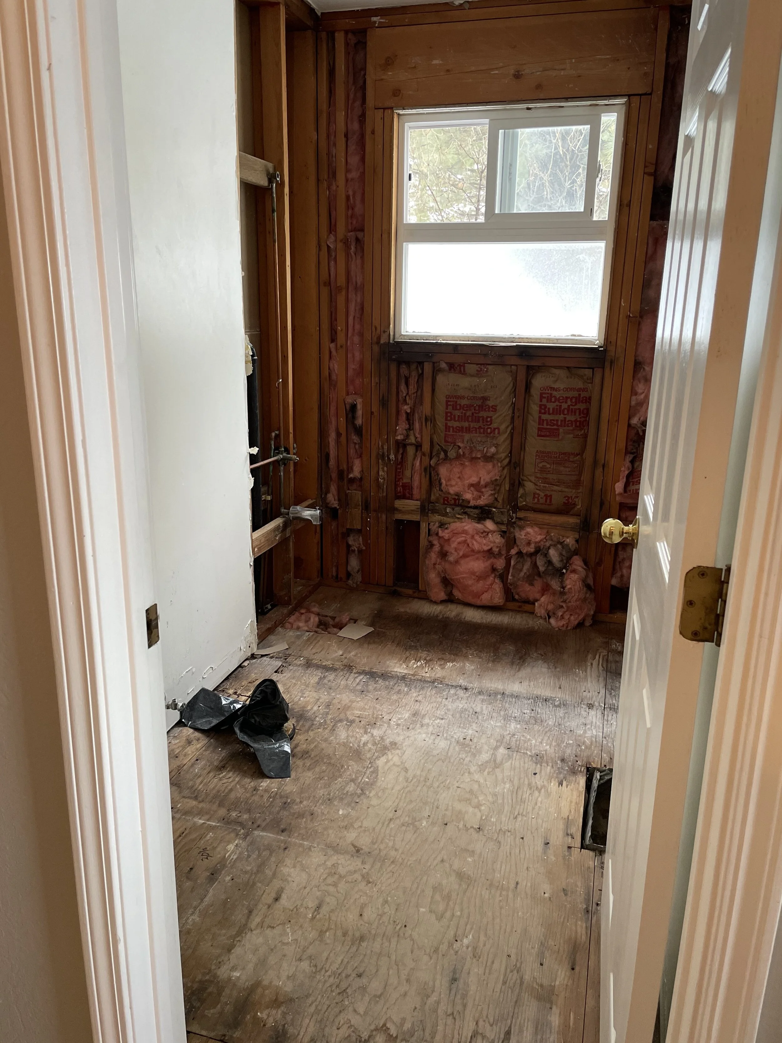
Before: Very cramped and VERY ugly. All of the wood pieces were rotting or dried out and desperately looking for a trashcan. It was not only dated, but nothing was in the right place or functional. The shower was too short for any normal adult and the towel racks were oddly placed so you couldn’t get out without elbow bruises. The vanity was a weird size for the space and the lights weren’t centered over the vanity. Oh and don’t forget about the rotting window sill (eeeeewwwww!).
Full Gut: The only thing salvageable was the drywall in the front half of the room. Everything else had to go! Notice the placement of the bathtub spout, spoiler alert, that moves. The good news, the wood was in better shape than we thought!
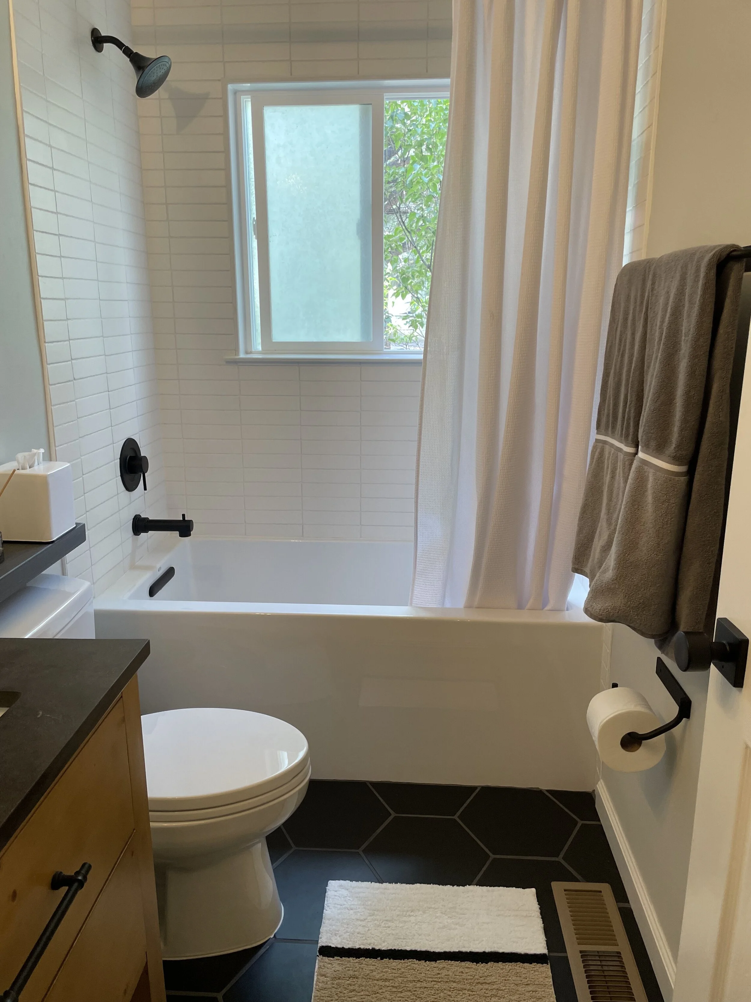
Progress! The tub has an extra large side to it so us big people can actually bathe in there without the water splashing out or most of your body being above water. But, because of the extra height, the team needed to move up the plumbing while they had the wall open. This allowed for a taller shower placement and repairs to the pipes to be done as well. The new window also helped us create a proper seal. Around it, they capped it off with a granite slab (aka window “saddle” in case your contractor says it and you look at them like I did) instead of tile for both easier installation and a super clean polished look.
The shower surround is done in a soft white fire clay tile, in a straight stack pattern (instead of a traditional subway) with matching grout. With the tone on tone look, we created visual interest without it feeling overwhelming. This can be a challenge to install because of the uneven tile, however it came out beautifully and felt worth the extra install time in the end.
One thing to note: if you are using hexagon shaped tile, go for larger grout lines. They aren’t perfectly even so the spacing can be a challenge when you are adding each new piece. Get everything in place quickly, this will allow you to nudge individual tiles as needed to space them more evenly before they set. The larger grout line will then help cover an discrepancies in the spacing so it appears even when you see it all together.
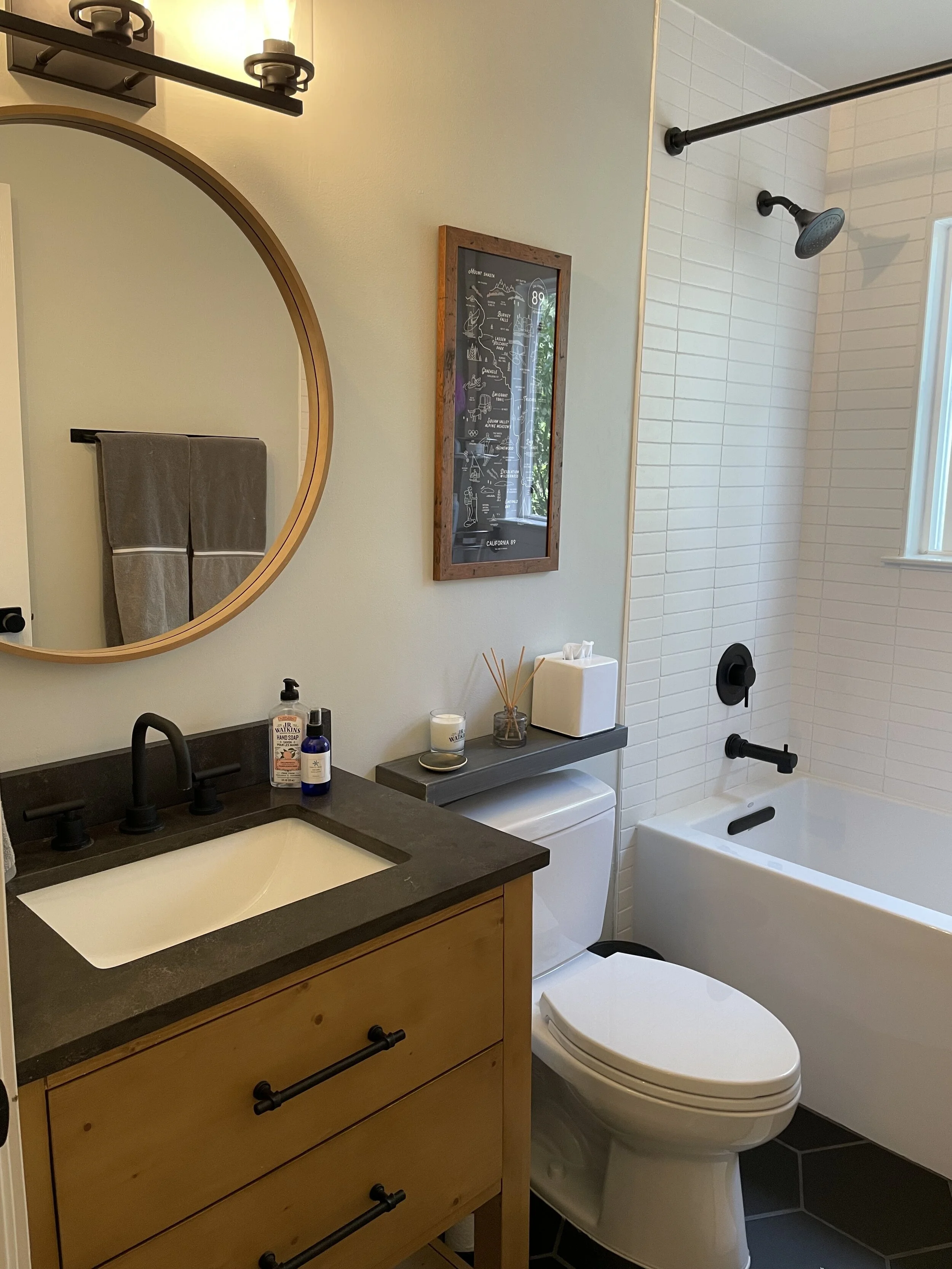
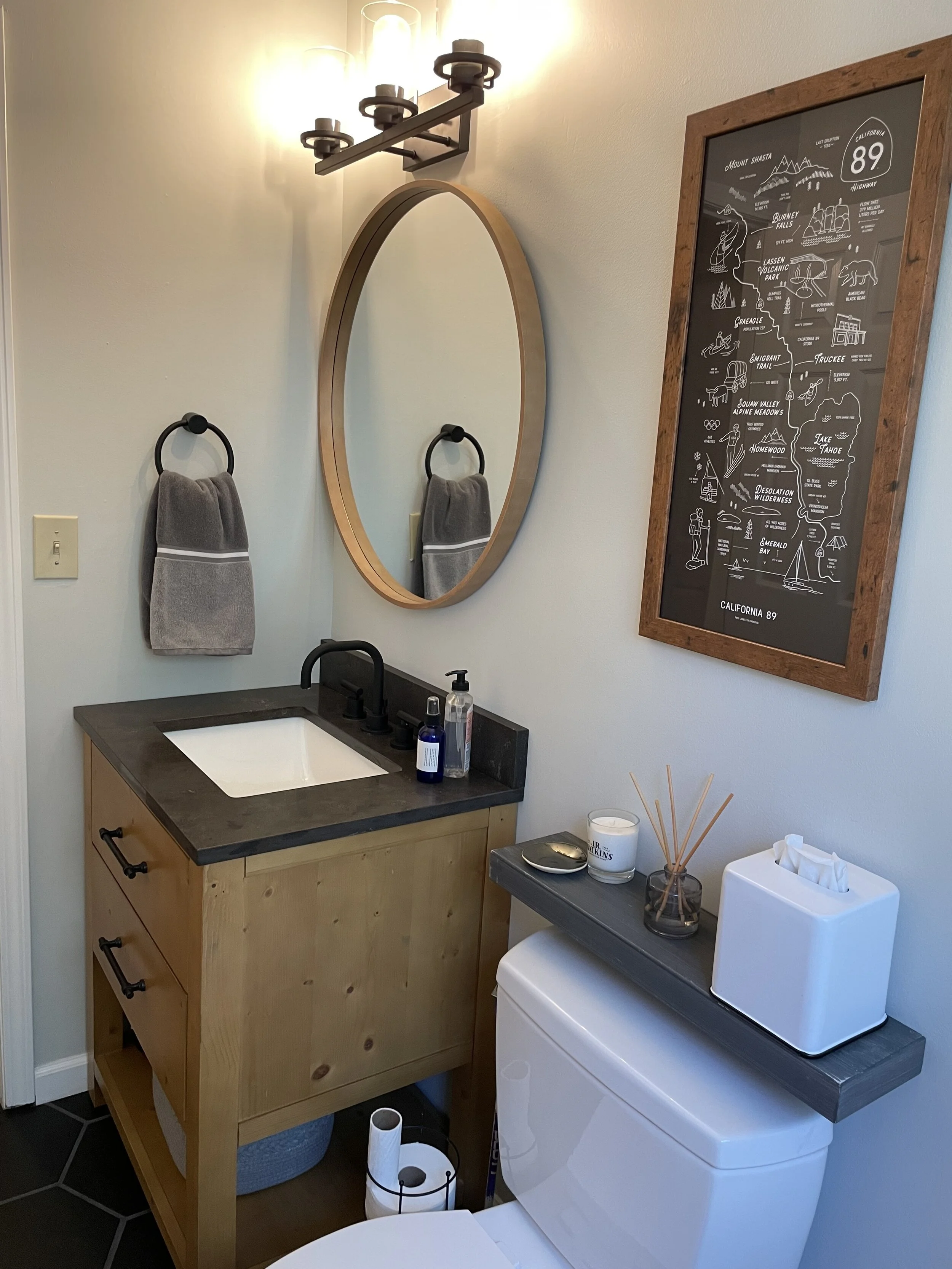
Finished product! The vanity came from Wayfair all in one piece with the countertop and sink installed (note, the first one was shattered so they immediately replaced it at no cost and no questions. They have the best customer service!). I went with a light wood to balance the dark flooring and countertop, but add some organic color and warmth. The matte black faucet tied nicely into the other black accessories and shower trim kit to create a cohesive, finished look.
We opted to forgo the medicine cabinet due to the stud running directly behind it, there was a limit to what Billy was willing to pay for at this point. But in the end we didn’t miss it. Note: Target has the best inexpensive mirrors if you just need a surface mounted option. And by using one with a wood frame the vanity was no longer the only thing in there in that wood.
I selected an industrial looking hardware collection from Industrial Farm Co. They are forged steel and handmade, making them imperfect in structure, but they also have a powder-coated finish which creates an overall polished look. These are super heavy duty and very durable so I expect that they will literally last a lifetime. Pro tip: don’t forget the hardware or the door knob, small changes like these can really impact the overall design of a space.
The wall color is from the Magnolia line, I was very impressed with how well their paint covers in one coat. It’s somewhere in between a white, gray and mint green, adding a very light wash of color to break up the white and black theme without creating too much to look at. The hint of green also warmed up the tone to tie in the organic wood.
The light fixture was one that you could hang in either direction, this was helpful since the junction box was very low. We were able to install it upwards to balance the space above the vanity without moving any electrical (huge time and cost saver!).


